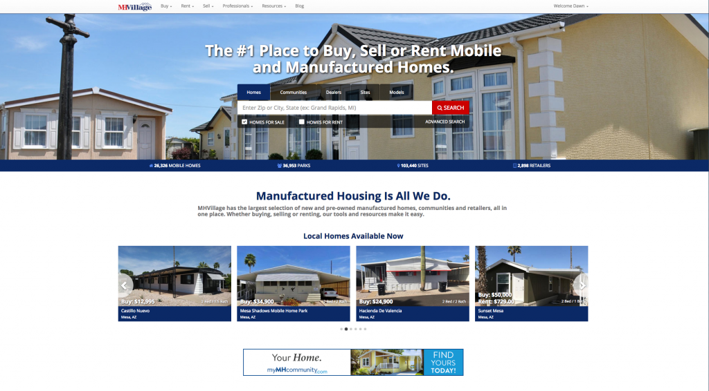
If you have been to MHVillage lately, you may have noticed a new look to our home page. We updated and released the new look just prior to the Tunica Show last month. We’ve tried to keep the same easy-to-use format manufactured home buyers have come to expect, while giving it a fresh new feel.
In addition, we updated the top navigation headers on MHVillage. This just means we’ve tightened up the top navigational headers as they appear across the site. Our goal is to get that out of the way, so home shoppers can see more information on the page. We want them focused on your listings.
More to come for MHVillage
However, it isn’t all about aesthetics. While having a more modern look on the site is pleasant to the eye, there is more to it. Traffic on the MHVillage mobile site continues to grow. Each month we see more and more traffic coming in on smartphones. This new look will be migrating to the mobile site, and from there, we plan on giving the entire site a facelift.
The new look will be using responsive design. This means that no matter what screen size someone is using, the website will respond to show that page correctly for the device.
Currently, most pages on MHVillage look great whether you are on a phone or using an extra large desktop screen, but there always is room for improvement. That improvement is one of our major goals for 2018. We will go over the whole site, adding improved function and style.
We also recently released a new account look that we have encouraged some of you to try. We’ll be rolling that out to everyone in the upcoming months. There will be a lot to see, including new features to help you with your business success this year!


